Taiwan Vibe
Taiwan Themed Travel Booking Search Page Design
MY ROLE
Team Leader, Wireframes, Branding, UIUX Design
DURATION
2 Weeks
INFO
This is a platform that features local activities in Taiwan, combining sightseeing activities with travel accommodations. It allows travelers to plan their trips by recommending local activities and finding accommodations that suit their needs.
QUICK OVERVIEW
CONCEPT IDEAS
After the pandemic, travelers worldwide have begun to venture out and explore again.
Taking reference from competitors like Airbnb, Rakuten Travel, etc., we discovered that participating in "local activities" is a way to deepen travel experiences and increase opportunities for cultural exchange.
Through promoting events such as concerts, seasonal activities, and local experiences, we can boost local tourism and enhance the attractiveness of the area. Thus, we have conceptualized our product strategy around combining Taiwan travel bookings with local activities and are now brainstorming how to define it.
BRANDING
We start from Taiwan's distinctive imagery, aiming to allow travelers to experience the local cultural charm and atmosphere of Taiwan through participating in local activities. Utilizing the trendy term "Vibe" in social media, we not only convey the travel experiences in Taiwan but also hope that travelers can plan their unique travel experiences through this website, booking accommodations, and thoroughly enjoy every moment in Taiwan.
LOGO & COLOR SCHEME
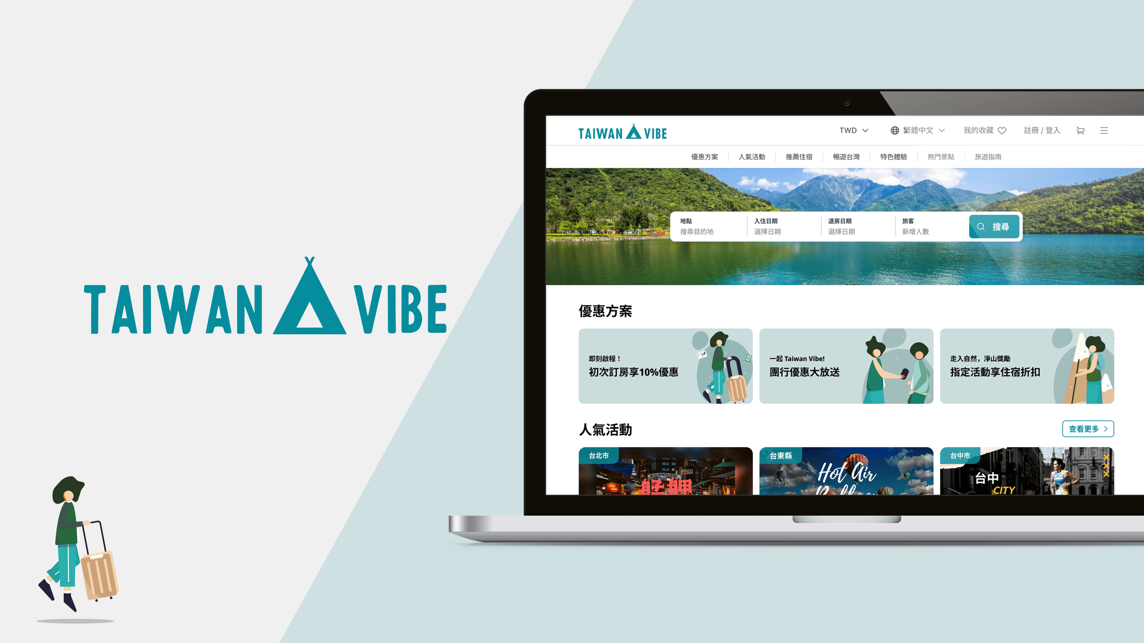
The logo design features a sans-serif font paired with a tent-shaped motif, symbolizing short-term stays and deep exploration, aiming to convey a sense of autonomy, ease, and freedom in travel atmosphere.
The main color scheme is selected from the blue-green hues of Taiwan's mountain and sea scenery, with the hope that users will feel the unique beauty of deep travel in Taiwan when they see these colors.
PRINCIPLES FOR DESIGNING LAYOUT
Clear Information Format Distinction
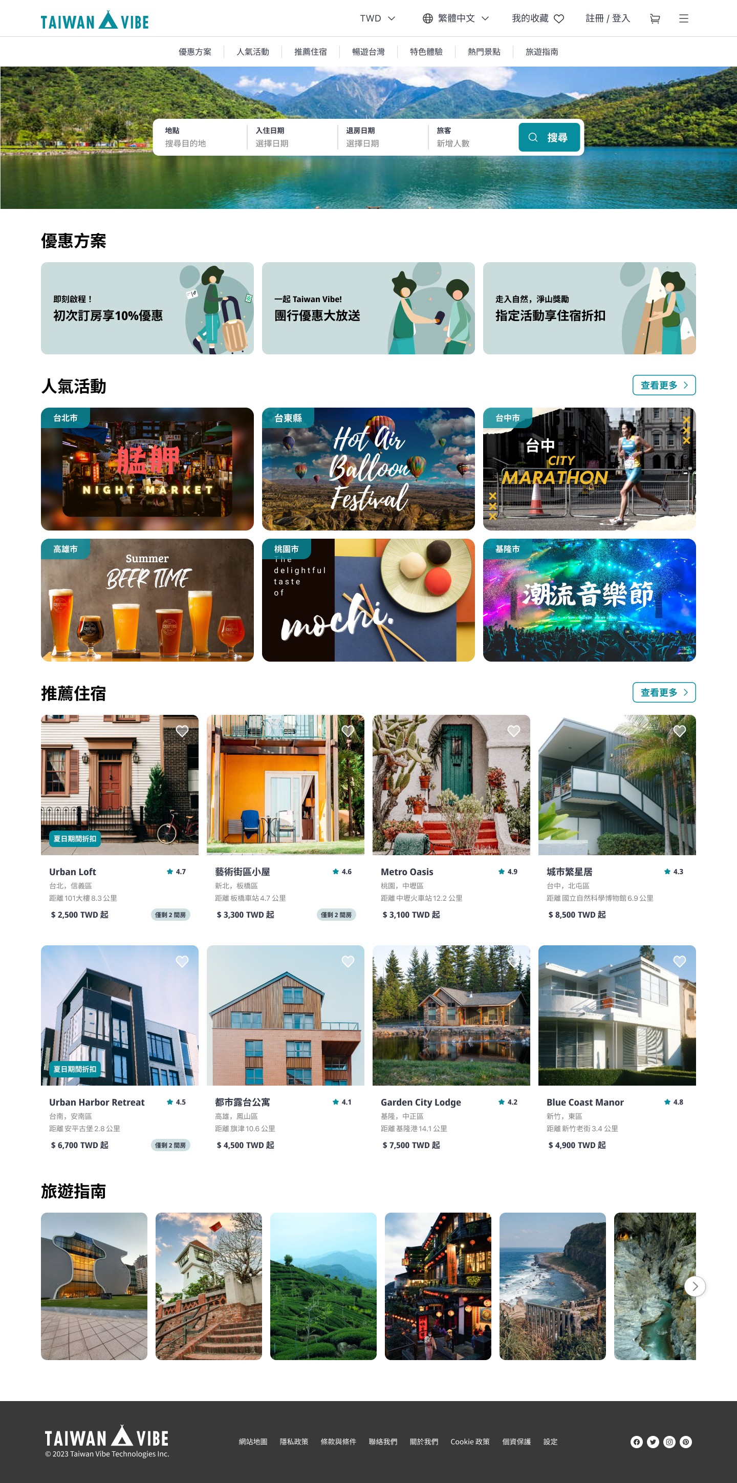
Present various sections, such as promotional offers, popular activities, travel guides, etc., in different formats to ensure users can easily distinguish between them. This prevents users from getting confused or visually fatigued while browsing, while also increasing their interest in exploring the website.
Unified and Simplified Color Scheme
The interface design prioritizes a main color scheme paired with neutral colors to avoid information overload caused by too many colorful images, ensuring ease of information browsing.
Clear Information Listing
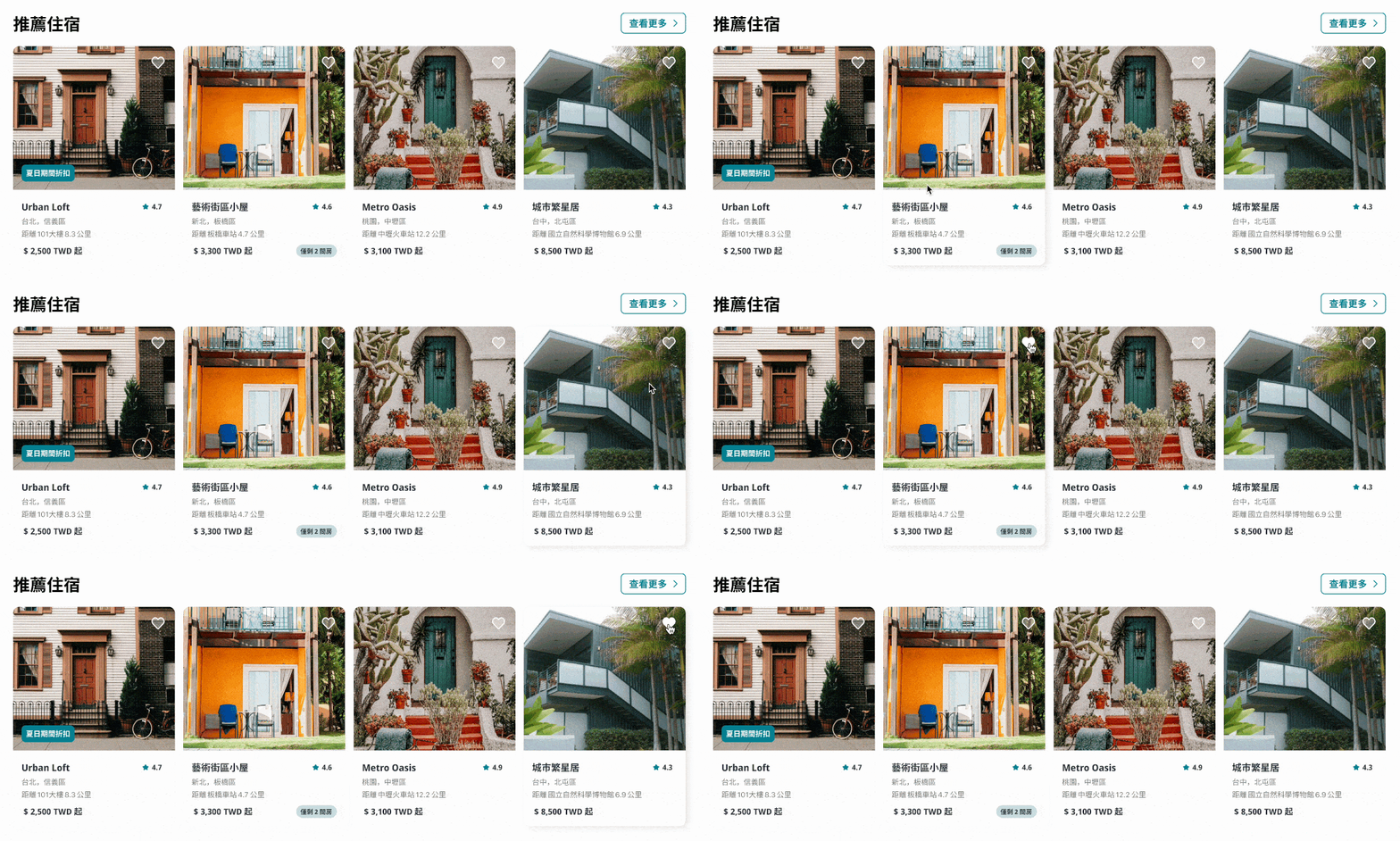
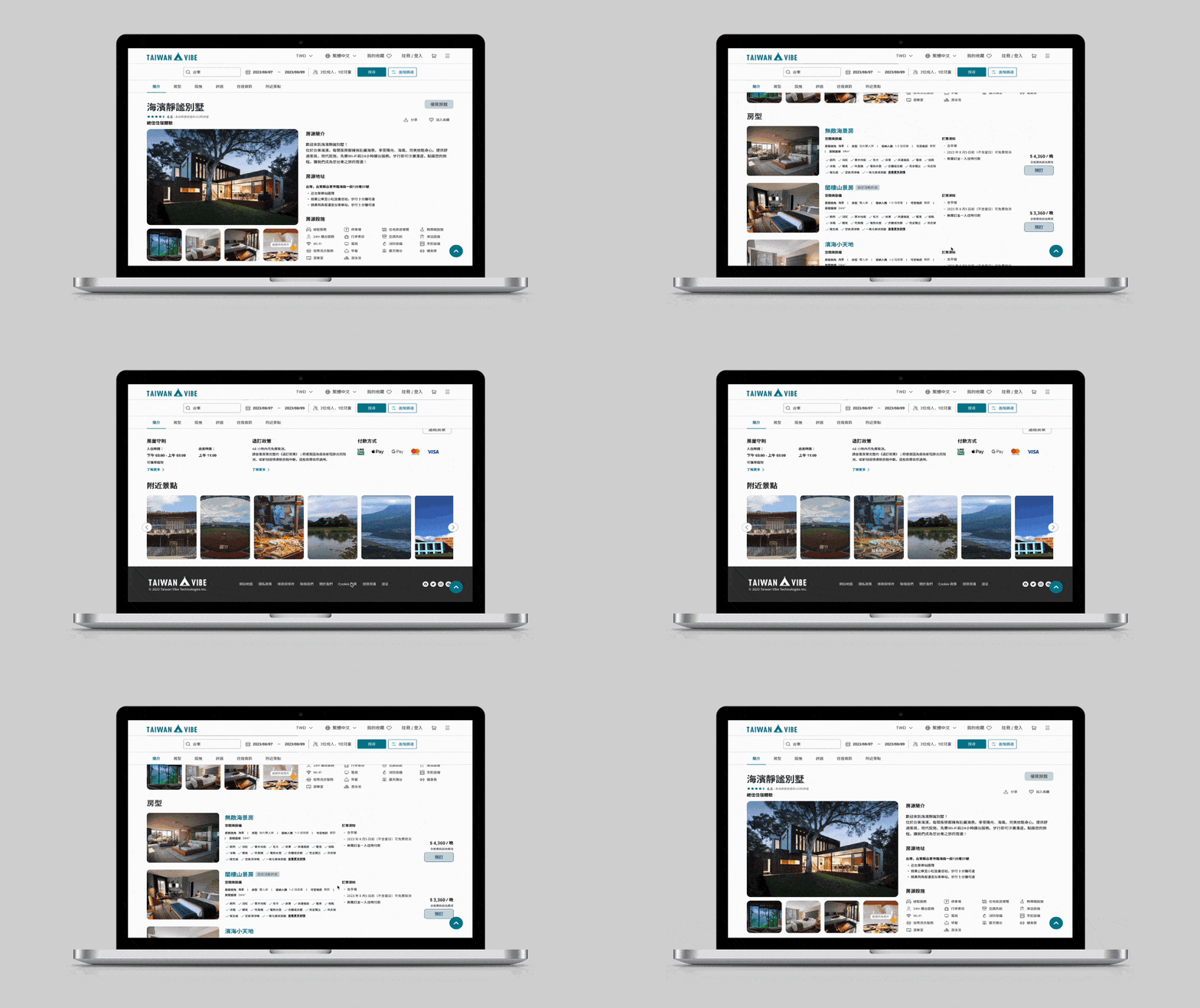
Clearly differentiate text blocks to avoid hierarchical confusion and prevent information overload (e.g., content on property listing pages).
Search Result Page Overview
ITERATION DIRECTION
1.Project Enhancement
Due to time constraints and the dispersed availability of the team for collaborative discussions, the allocated time for user research was relatively short, with a heavier focus on UI design planning. To enhance the project further, additional components such as user research, usability testing, and other operational processes can be supplemented to provide a more comprehensive analysis and exploration.
2.Project Expansion
While this iteration primarily focused on desktop web design, considering the immediacy and mobility of mobile devices, future iterations can explore creating a mobile version interface. This would allow Taiwan Vibe to provide tourists with more immediate inspiration for participating in local activities and accommodations.
PROCESS AND REFLECTION
This project was a short-term endeavor created in conjunction with an online course, requiring coordination among team members from different backgrounds and locations. Additionally, it needed to be completed within two weeks, necessitating effective collaboration, content integration, decision-making, and progress control.
The design outcome was not flawless, and many aspects of the visual planning were somewhat rough. However, through the process and subsequent review, there is an opportunity to reanalyze and adjust the content hierarchy and UI visual details. Through this project, I realized that UI/UX design involves numerous methods and details that need to be balanced, and it's through continuous iteration that we gradually align with user expectations and experiences.
