Zuny Rebranding
CREADITS
Brand Strategy: Yuli Cheng
Product and campaign photography courtesy of Zuny
MY ROLE
Brand Identity Design, Custom Logo, Graphic Design, Design Role
INFO
Zuny is a Home Deco brand rooted in synthetic-leather handicrafts. Well-known for its paperweights and bookends, Zuny creatively shortens the distance between items and people by applying soft curves to enhance the vivid images of objects.
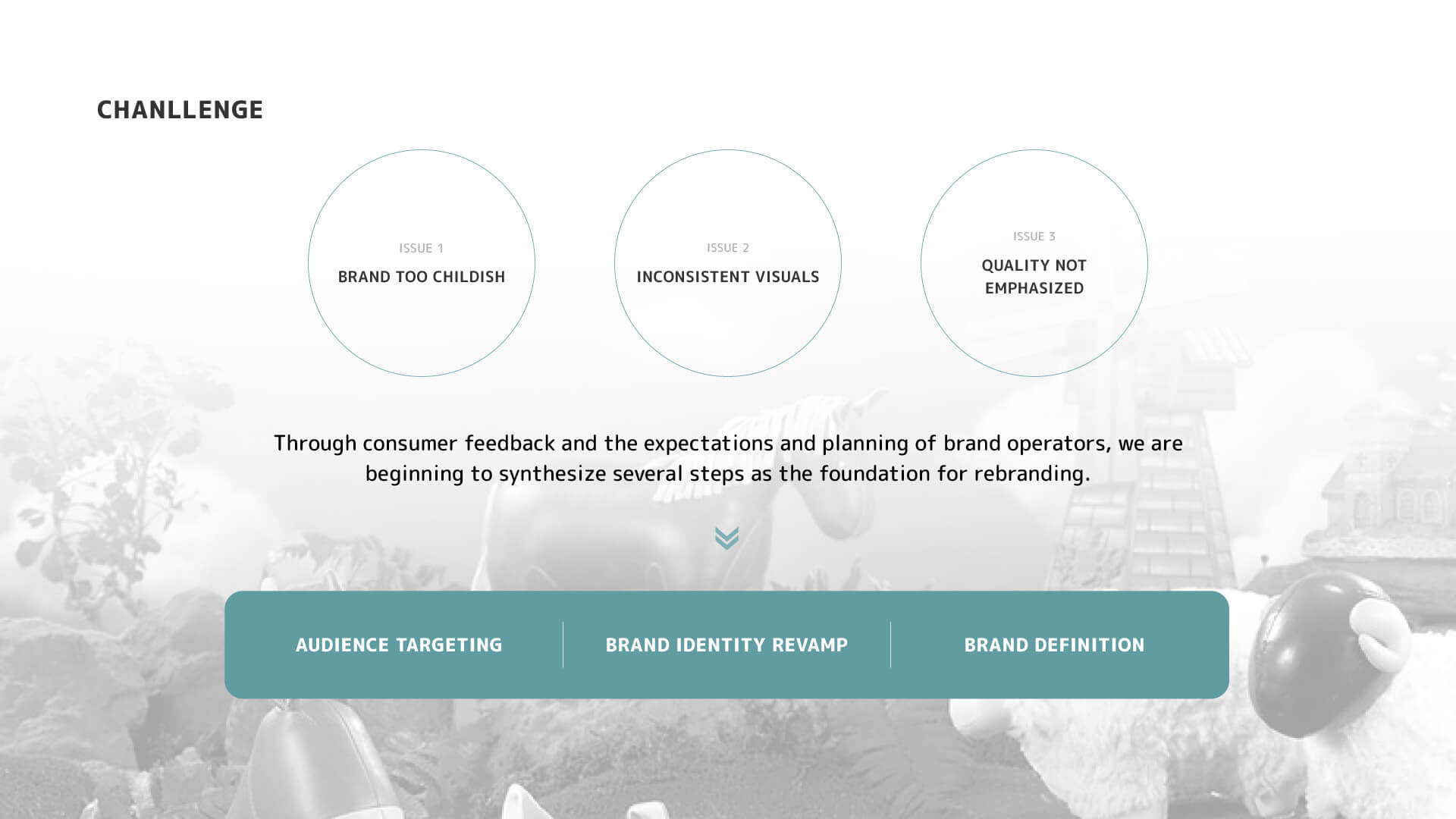
Due to its initial focus on home decor products featuring friendly animal shapes, the brand easily associated itself with playful items. In order to enhance the brand image and attract a middle to high-end consumer base, a brand overhaul was initiated in 2017.
STRATEGY
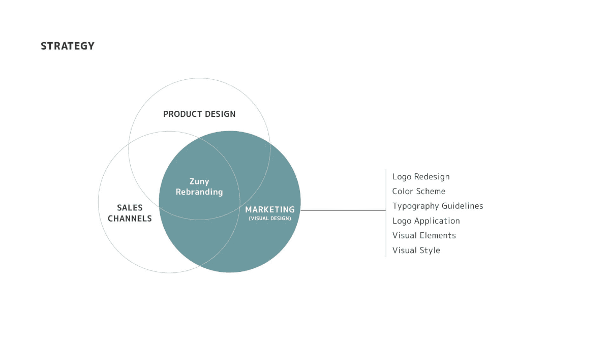
We revitalized our brand by fine-tuning product design, optimizing sales channels and communication strategies, and crafting compelling marketing visuals.
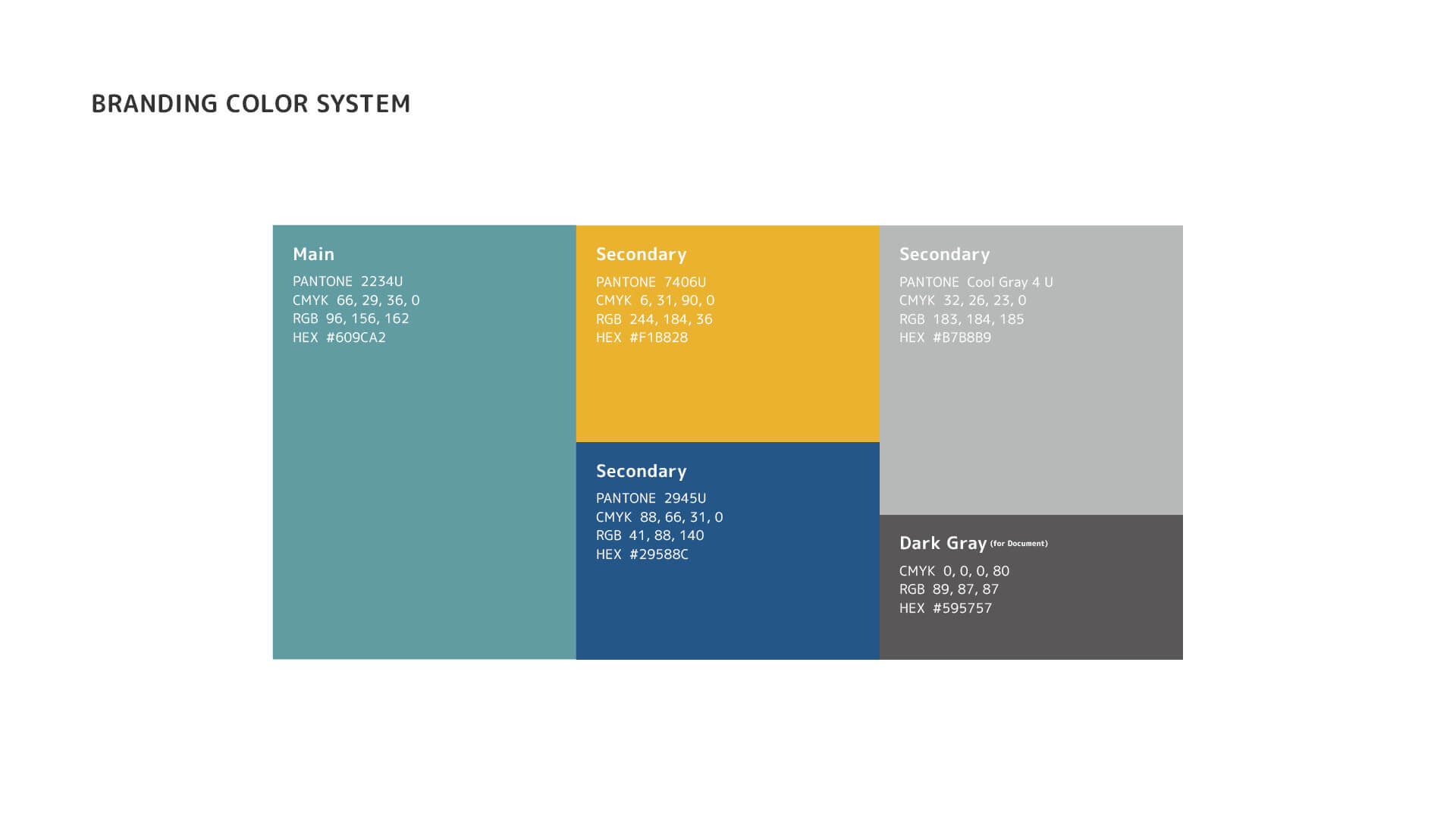
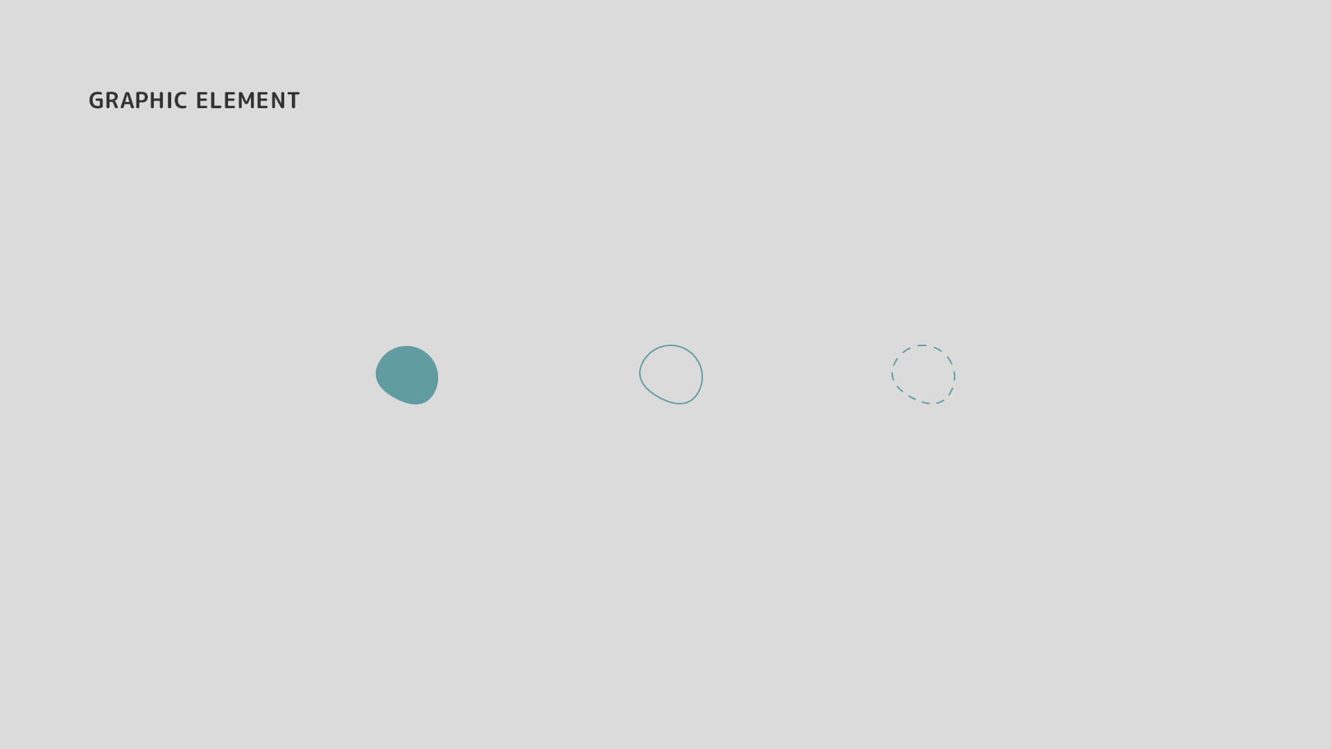
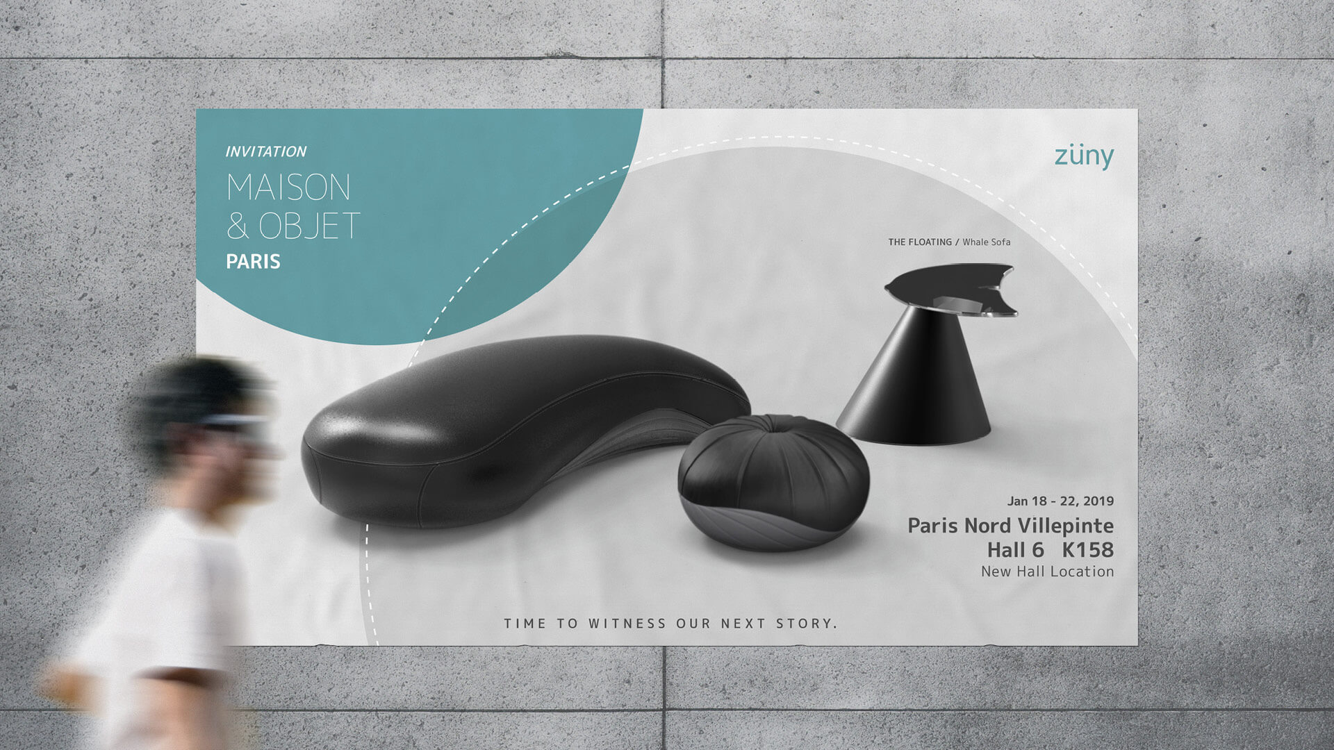
Concurrently, we enhanced brand visibility by actively participating in international home decor exhibitions. In terms of visual identity, we refined our logo, expanded the utilization of brand elements and color palettes, and established a unified visual direction for future endeavors.
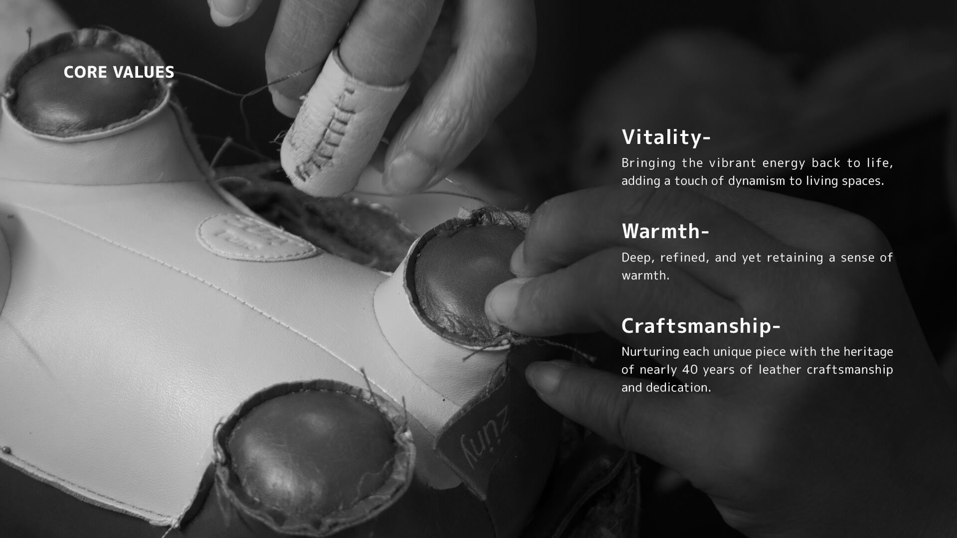
Drawing insights from consumer feedback and thorough research, we pinpointed the core values of our products as vitality, warmth, and meticulous craftsmanship. Going forward, our design ethos will be rooted in these principles, effectively conveying this compelling imagery to our target audience.
LIMITATIONS
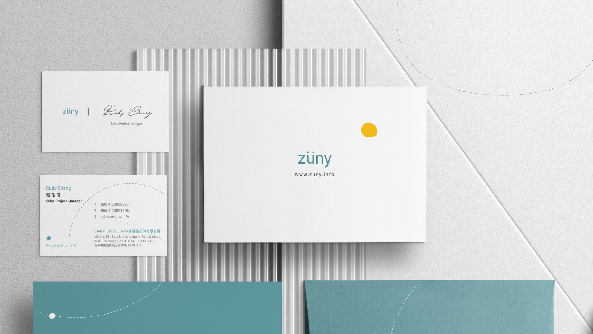
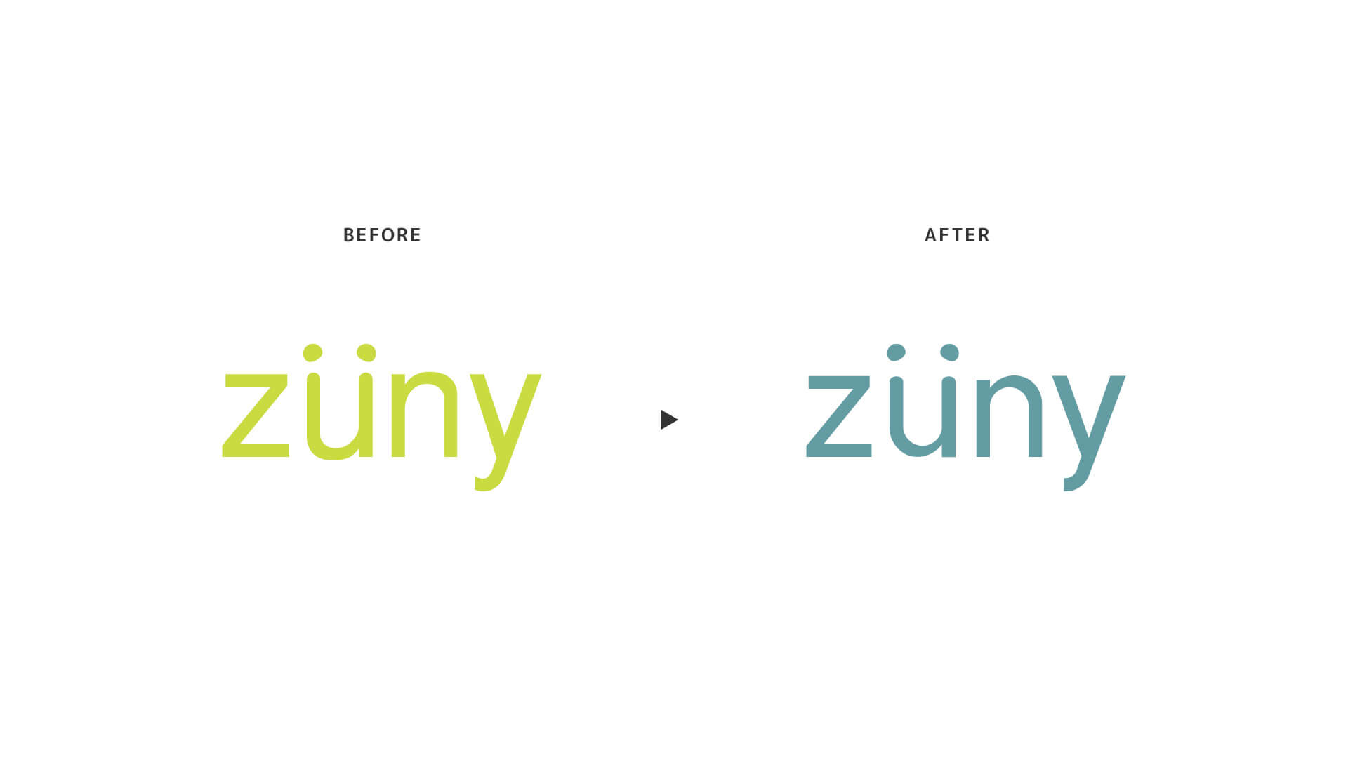
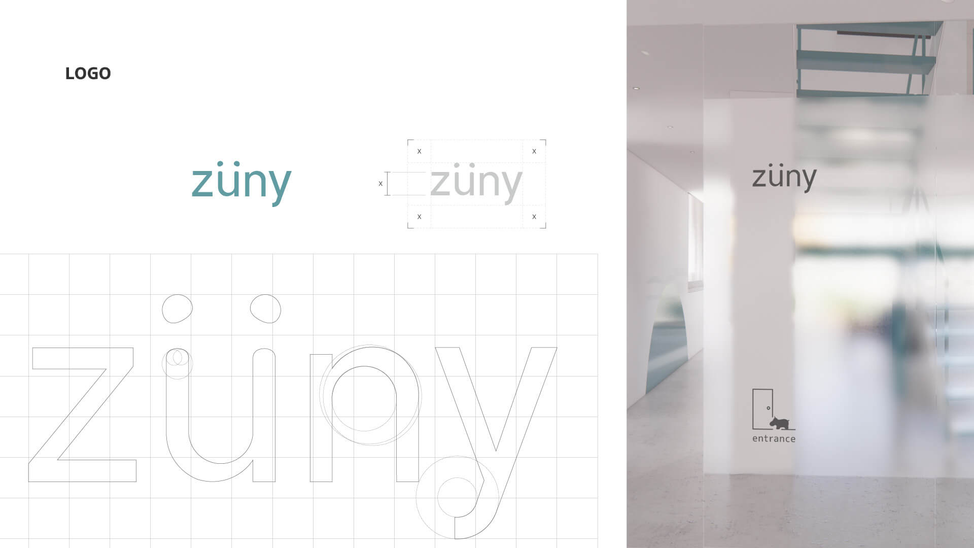
Considering consumer adaptability to brand recognition, the logo design underwent minimal adjustments in terms of form. The transformation of the brand's visual impression has been gradually achieved through the establishment of design specifications.
APPLICATION OF BRAND ELEMENTS
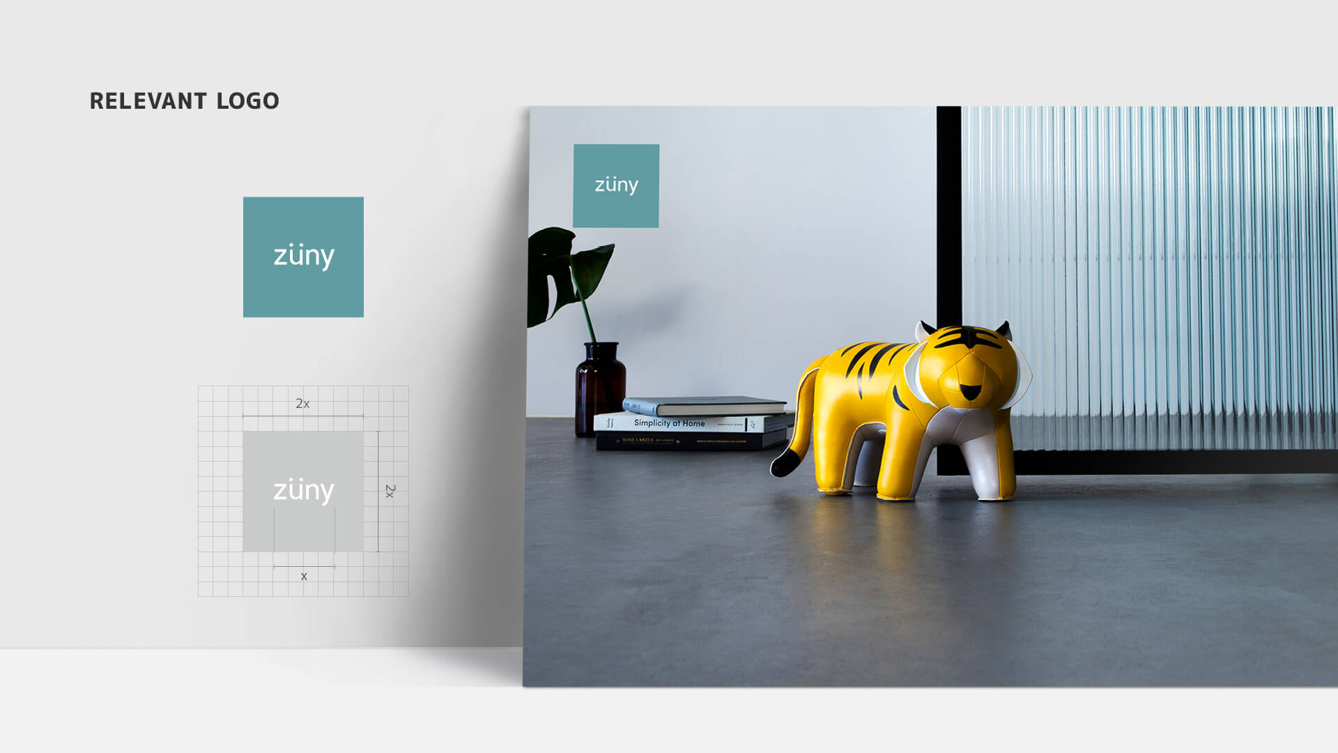
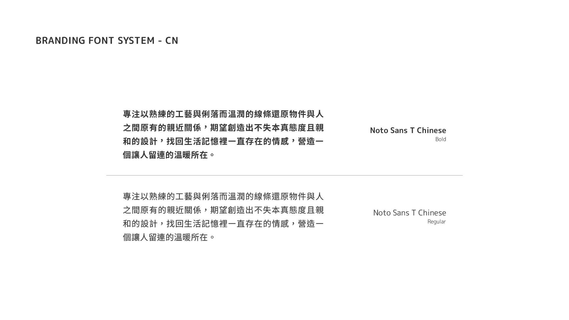
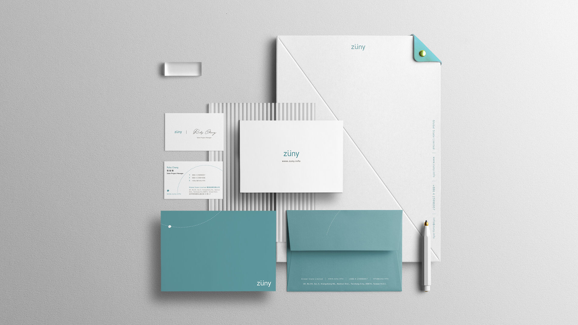
Through brand color planning, font specifications, and the definition of design elements, we extensively apply these elements in the brand's surroundings and showcase relevant areas.
LEARNING AND FUTURE ITERATION DIRECTIONS
In this project, I collaborated with colleagues from diverse backgrounds in iterating the brand. Through perspectives like marketing, business, and product design, I gained insights into different departments' expectations and pain points regarding the brand. Based on feedback and research results, I adjusted and conceptualized the brand's visual development direction. I also balanced realistic constraints and obtained a compromise, acknowledging that the branding visuals' standards weren't entirely perfect.
Regarding the brand's visual iteration, in the future, there could be more detailed definitions for the use of graphic frameworks and elements' rules. Additionally, by setting up modules, templates could be provided for colleagues in different departments to use, enabling the brand's ideology and visual identity to be more widely applied across various facets.
